Washed Up
Brand Identity
Brief
The ceramics start up approached me to brand the business.
After studying abroad Hannah the creator wanted the ceramics to reflect traditional Cypriot techniques, “super raw, super simple glazing” but solid, long-lasting, nice-to-hold shapes. The name stemmed from a legend from the town of Paphos, of Aphrodite washing up on their shores.
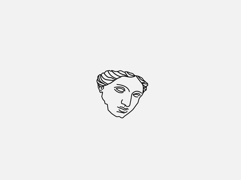
The deity statues throughout Europe were a great reflection of both the ancient makers techniques, their durability over time and also an over-arching cultural heritage. A piece of a statue literally became the face of the business, reflecting power, prestige but also the delicate nature of the objects themselves.